Tuesday, March 11, 2014

New Graphs: Confidence Intervals


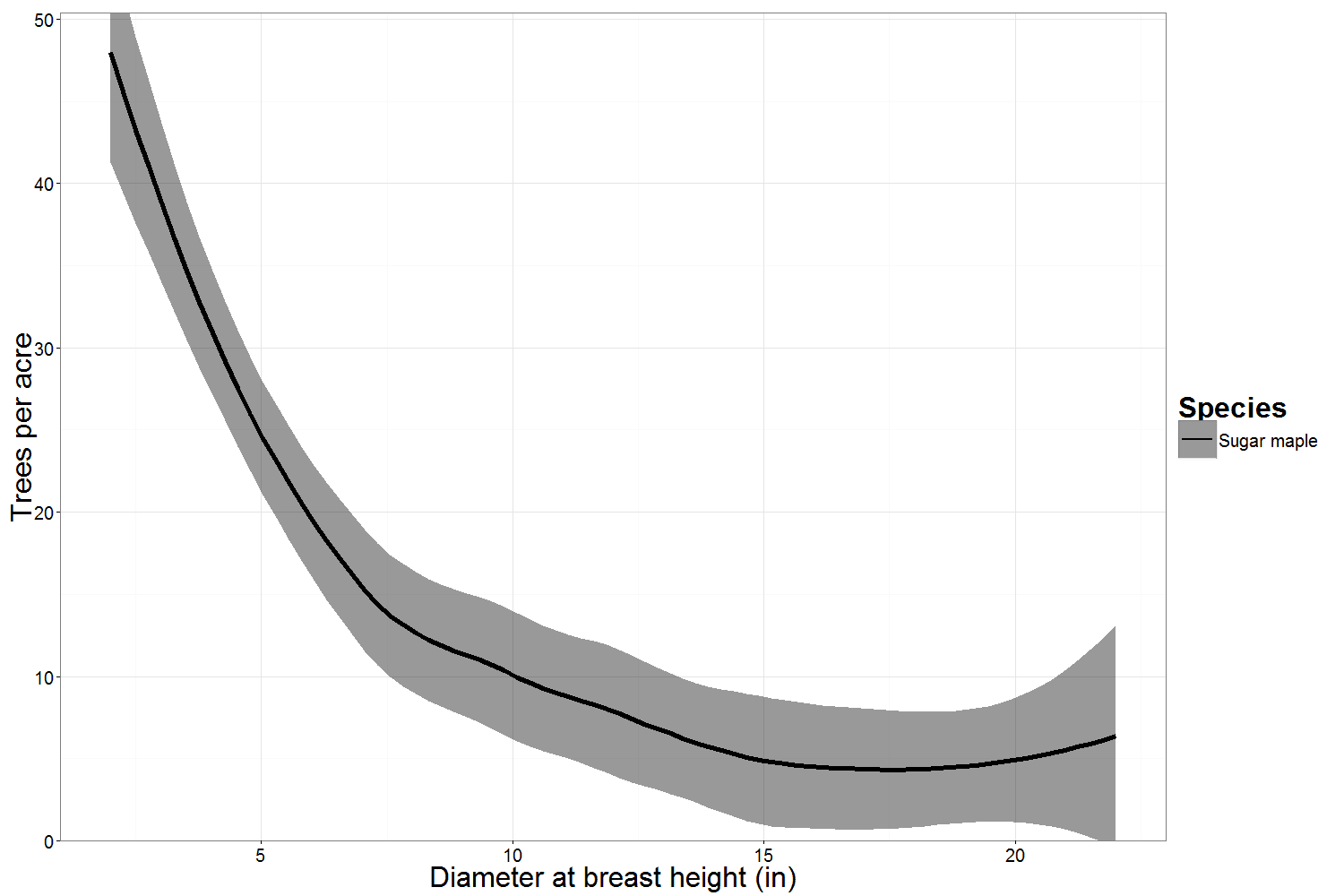
In this blog post we’re going to explain how a confidence interval is calculated, and show some examples of data that lead to very wide or very narrow confidence intervals. We hope this will help you understand and interpret both the lines on the graphs and the composition of the stands you measure and manage. The graphs we create as part of your free basic report in Plot Hound are a summary of the plots you measured within the stand. The confidence intervals on the graphs reflect the variation between the plots for each species and each size class.


Plot
Spp
DBH


2
4
6
8
10
12
14
16
18
20
22
1
SM
20
16
10
8
6
4
4
2
2
4
2
2
SM
30
24
15
12
9
6
6
3
3
6
3
3
SM
30
24
15
12
9
6
6
3
3
6
3
4
SM
10
8
5
4
3
2
2
1
1
2
1
5
SM
40
32
20
16
12
8
8
4
4
8
4

Confidence intervals reflect the standard error of the average value. For a graph like the one above, the solid line is the average number of sugar maples per acre from all the plots measured. 

We're using a 90% confidence level to determine the confidence interval in these graphs. That means that if you sampled this stand 100 times, you would expect your estimates to fall within the confidence interval above 90 of those 100 times.

We calculate the width of confidence interval by multiplying the standard error (the standard deviation of the mean, divided by the square root of the number of plots) by a statistic (the t-statistic) that is determined by the confidence level we chose.  

So we have two ways of making our confidence interval narrower. One way is to decrease our confidence level. The other is to sample more plots. A 95% confidence level would make the t-statistic larger and the confidence intervals wider; an 80% confidence interval would make the t-statistic smaller and the confidence intervals narrower. However, decreasing the confidence increases the probability that our confidence intervals do not contain the true mean of the population. If more plots are sampled, generally speaking, the confidence interval shrinks. 

- - -


You can control the confidence level and the number of plots, but there's another factor that influences the width of the confidence interval... the "standard deviation" (the variability between plots).


In the example above, all of the plots had differing numbers of trees of each diameter. Suppose that instead, all of the plots had the exact same number of trees measured in each diameter:


Plot
Spp
DBH


2
4
6
8
10
12
14
16
18
20
22
1
SM
20
16
10
8
6
4
4
2
2
4
2
2
SM
20
16
10
8
6
4
4
2
2
4
2
3
SM
20
16
10
8
6
4
4
2
2
4
2
4
SM
20
16
10
8
6
4
4
2
2
4
2
5
SM
20
16
10
8
6
4
4
2
2
4
2


You can see that the confidence intervals are much narrower.  The variance between plots is actually zero in this example, but the confidence intervals are still present because of the smoothing function used in the graph.


We can also see how the graph changes if one plot is very different from the others.  Let’s take the first example plot, but say that no trees were measured in Plot 1, and twice as many were measured in Plot 5.


Now suppose there are twice as many plots in the sample:


Plot
Spp
DBH


2
4
6
8
10
12
14
16
18
20
22
1
SM
20
16
10
8
6
4
4
2
2
4
2
2
SM
30
24
15
12
9
6
6
3
3
6
3
3
SM
30
24
15
12
9
6
6
3
3
6
3
4
SM
10
8
5
4
3
2
2
1
1
2
1
5
SM
40
32
20
16
12
8
8
4
4
8
4
6
SM
20
16
10
8
6
4
4
2
2
4
2
7
SM
30
24
15
12
9
6
6
3
3
6
3
8
SM
30
24
15
12
9
6
6
3
3
6
3
9
SM
10
8
5
4
3
2
2
1
1
2
1
10
SM
40
32
20
16
12
8
8
4
4
8
4

Note that plots 6-10 are the same as plots 1-5, but the confidence interval is smaller because the overall sample includes more data.

- - -


In all of these examples, we’ve been modifying the distribution of one species.  Let’s look at one more example with two species, one common to all plots and one only found in a few plots:


Plot
Spp
DBH


2
4
6
8
10
12
14
16
18
20
22
1
SM
20
16
10
8
6
4
4
2
2
4
2
1
YB
0
0
0
0
0
0
0
0
12
0
0
2
SM
30
24
15
12
9
6
6
3
3
6
3
2
YB
0
0
0
0
0
0
0
0
0
0
0
3
SM
30
24
15
12
9
6
6
3
3
6
3
3
YB
0
0
0
0
0
0
0
0
12
0
0
4
SM
10
8
5
4
3
2
2
1
1
2
1
4
YB
0
0
0
0
0
0
0
0
0
0
0
5
SM
40
32
20
16
12
8
8
4
4
8
4
5
YB
0
0
0
0
0
0
0
0
0
0
0

As you can see, the yellow birch diameter distribution shows up in a different color and style.  As more and more species are added, there is an increasing diversity of colors and styles to differentiate them.  The same reasoning we applied above holds for interpreting the yellow birch confidence interval.

By now you should have a good sense for how the confidence level, number of plots, and stand variability influence your confidence intervals.  Be on the lookout for upcoming posts about sampling and statistics!

Wednesday, February 26, 2014

New Graphs: The Details

Every time you cruise with Plot Hound, you automatically get a bunch of beautiful graphs for free.  In this post, we'll walk through how to interpret all of the new graphs.


The basic graph of diameter distributions is similar to the previous version.  Graphs now use a more distinctive color palette, and contain both solid and dashed lines depending on how many unique species are present.

Based on your feedback, we know that this basic graph can be difficult to read and interpret when a stand has a large number of unique species present.  We’ve added a selection of other graphs to aid in visualization of stand structure, both for individual species and the dominant species in a stand.


There are two faceted graphs showing the distributions of individual species.  One is black and white and one is in color; otherwise, they are identical.  The color graph uses the same colors for each species as the overall graph, for continuity and so you can compare back-and-forth.  The faceted graphs show the distribution of each species separately, without the overlapping that occurs when all are graphed on the same axis.

The example graph here shows that the faceted graph provides additional information about species that is hard to discern from the overall graph.  Looking at the overall graph, it’s difficult to see the distributions in the middle and larger diameter classes.  The faceted graph shows more easily that, for example, there are similar distributions of hickory and elm species in the middle diameter classes, with the largest number of trees per acre occurring around the 18-inch diameter class. You can also see that water oak shows a similarly-shaped distribution but with the largest number of trees per acre in approximately the 15-inch diameter class.


The next new graph shows only the distributions of the three most dominant species in the stand.  Dominance is defined in this case by the three species with the highest basal area. This figure highlights those three species, showing their relative distributions, without being crowded with the additional curves for all the other species in the stand.


The final new graph is simply a breakdown of the species in the stand into broad hardwood and softwood categories.  We’re using the USFS Forest Inventory and Analysis definitions for hardwood and softwood for North American species - softwoods are conifers, hardwoods are deciduous.  Aspen species are “hardwood”.

You may also notice that there are smooth confidence intervals around the curves, gray in the faceted graphs and colored in the graphs of dominant species and major species group.  Those are 90% confidence intervals (we'll explain how to interpret these in the next post).  The width of the interval reflects the variability of the species between measured plots.  We’ll do a future post showing the connection between plot- and stand-level data and those confidence intervals, to aid in their interpretation.

As before, the graphs reflect English units - trees per acre, and diameter in inches, and as before, please contact us if you are interested in different units or graphs! We’re always interested in hearing what you think about the new graph options, and if there’s anything else you’d like to see.

Tuesday, February 11, 2014

Download SHP/KML/GPX for cruises

One of the top feature requests for Plot Hound was for SHP/KML/GPX downloads of stand bounds and plot locations.  Now it's easy to get these files - just look on your cruise page and you'll see a new "Download" dropdown.


Friday, February 7, 2014

Quick Add for Plot Hound

One of our top requests (usually from those of you working in southern pine plantations) has been for a quicker way to add measurements for your most common trees.  Today we're rolling out a change that should really speed up your cruising.


On your "Trees" screen, you'll now see a mini-form for entering a species and diameter.  Simply select the species and diameter you'd like, and then hit "Quick add tree" to add that measurement.  You can hit the button multiple times to add multiple trees, as shown below.


You'll also notice that we've also sped up data entry for the "old" screen too.   We've focused on making everything feel much snappier so that you can focus more on cruising and less on data entry.

Saturday, February 1, 2014

New Year, New Graphs

At SilviaTerra, we're welcoming in the new year with a total refresh. Our redesign was focused on formatting and presenting your data in a way that makes it easy to understand.


If you've been using the Plot Hound app or website lately, you've probably noticed a clean new look that puts your data front and center. One of the biggest changes we made was improving the quality of the graphs that get generated when a cruise is completed.

We’ve tweaked the diameter distribution graphs that are produced as part of your basic cruise summary.  Now you'll see additional graphs that show different views of the data, emphasizing different aspects of the forest composition.

Over the next few weeks we’ll do a series of blog posts talking about those graphs in more detail, highlighting some of the differences among the various new graphs and providing some guidelines for interpreting them.

Monday, January 27, 2014

The best gets better - Plot Hound improvements in 2014

At SilviaTerra, we're on a mission to build the best tools in forestry.  We're kicking off the new year with a couple big improvements to the website and Plot Hound app.  Our focus was on simplicity, speed, and beauty.  Here's to another year of pushing forest inventory forward - easier, faster, and cleaner than ever before.


Plot Hound
In September 2013, SilviaTerra welcomed a new member to the crew.  In his first few months, Samad rewrote Plot Hound from the ground up to be more responsive and intuitive than ever.  You should notice an improved syncing experience and significantly faster data entry.  He also added features for collaborative cruising and cruise notes/instructions.


Quickly enter diameters from a select drop down or type them in manually

See who is assigned to each plot

Website
Over the past few months, you've probably noticed some big changes on the website.  Not only did many pages get much faster, but we've added collaborative cruising features and totally redone your cruise reports to make them more informative and elegant than ever.


Setting up cruises has never been simpler. You can now include instructions for the cruiser too.


Find stands easily with state/county listings and a search bar


Cruise reports are automatic, informative, and beautiful. More details coming in a future post

Lots more coming over the next few weeks - so don't be a stranger round these parts!

Tuesday, August 6, 2013

Volume Reports Graduate from Beta!


We're proud to announce that volume reports have graduated from "beta"!  We've rolled out a number of improvements to provide you with the maximum amount of information while keeping bloat to a minimum.

Over the past 6 months, we've received lots of feedback from you all on our "beta" volume reporting service.  In that time, we've received lots of inquiries about the volume calculations.  Common ones include:

  • What exactly is in a SilviaTerra volume report?
  • How are total and merchantable heights estimated?
  • How are volume equations selected in each region?
  • How are trees merchandised into products?

Over the coming weeks, we'll show you what's going on under the hood and dive into the details of each of these questions.  As always, please post any questions or comments below and we'll get right back to you.