

Plot
|
Spp
|
DBH
| ||||||||||
2
|
4
|
6
|
8
|
10
|
12
|
14
|
16
|
18
|
20
|
22
| ||
1
|
SM
|
20
|
16
|
10
|
8
|
6
|
4
|
4
|
2
|
2
|
4
|
2
|
2
|
SM
|
30
|
24
|
15
|
12
|
9
|
6
|
6
|
3
|
3
|
6
|
3
|
3
|
SM
|
30
|
24
|
15
|
12
|
9
|
6
|
6
|
3
|
3
|
6
|
3
|
4
|
SM
|
10
|
8
|
5
|
4
|
3
|
2
|
2
|
1
|
1
|
2
|
1
|
5
|
SM
|
40
|
32
|
20
|
16
|
12
|
8
|
8
|
4
|
4
|
8
|
4
|
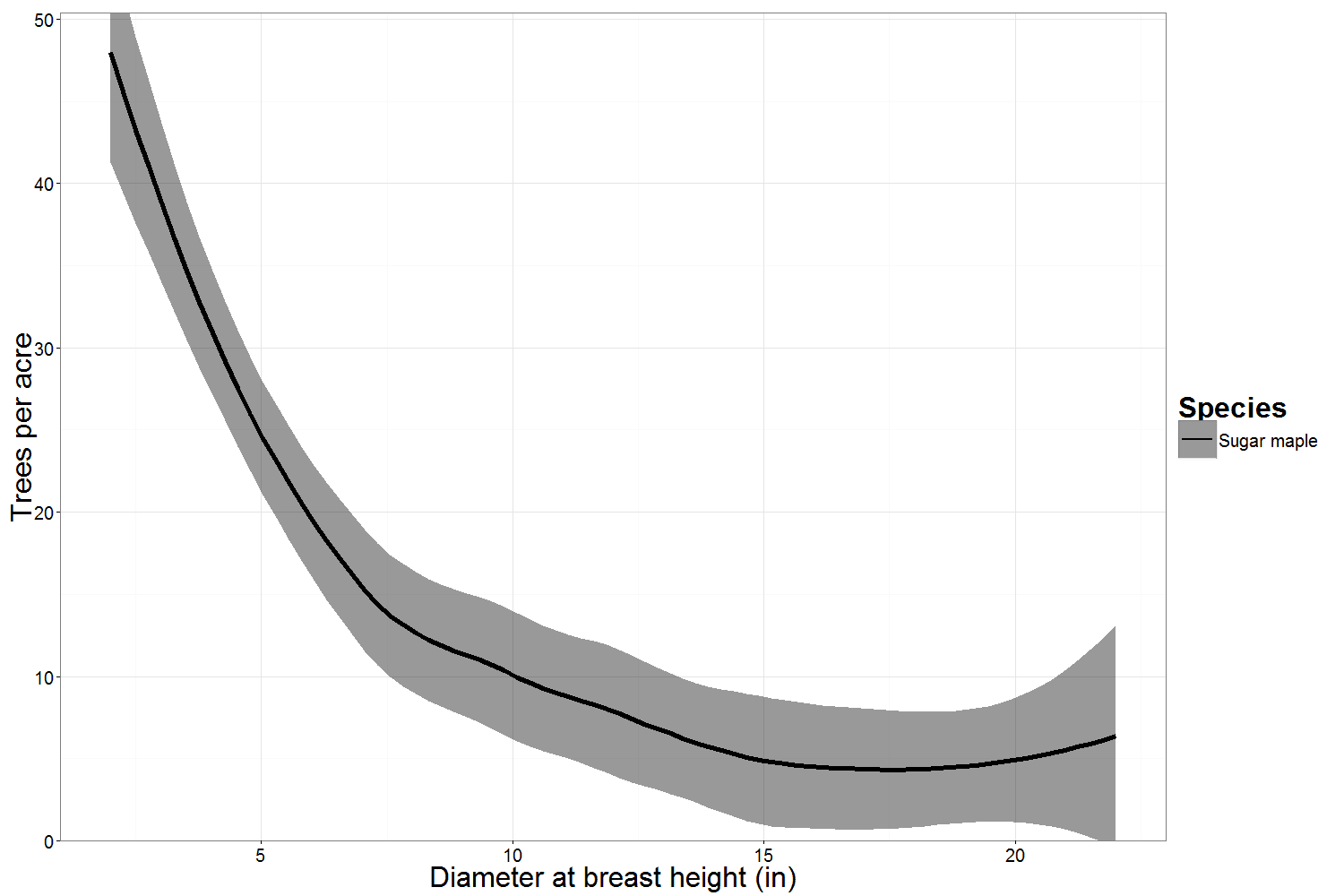
Confidence intervals reflect the standard error of the average value. For a graph like the one above, the solid line is the average number of sugar maples per acre from all the plots measured.
We're using a 90% confidence level to determine the confidence interval in these graphs. That means that if you sampled this stand 100 times, you would expect your estimates to fall within the confidence interval above 90 of those 100 times.
We calculate the width of confidence interval by multiplying the standard error (the standard deviation of the mean, divided by the square root of the number of plots) by a statistic (the t-statistic) that is determined by the confidence level we chose.
So we have two ways of making our confidence interval narrower. One way is to decrease our confidence level. The other is to sample more plots.
A 95% confidence level would make the t-statistic larger and the confidence intervals wider; an 80% confidence interval would make the t-statistic smaller and the confidence intervals narrower. However, decreasing the confidence increases the probability that our confidence intervals do not contain the true mean of the population. If more plots are sampled, generally speaking, the confidence interval shrinks.
- - -
You can control the confidence level and the number of plots, but there's another factor that influences the width of the confidence interval... the "standard deviation" (the variability between plots).
In the example above, all of the plots had differing numbers of trees of each diameter. Suppose that instead, all of the plots had the exact same number of trees measured in each diameter:

Plot
|
Spp
|
DBH
| ||||||||||
2
|
4
|
6
|
8
|
10
|
12
|
14
|
16
|
18
|
20
|
22
| ||
1
|
SM
|
20
|
16
|
10
|
8
|
6
|
4
|
4
|
2
|
2
|
4
|
2
|
2
|
SM
|
20
|
16
|
10
|
8
|
6
|
4
|
4
|
2
|
2
|
4
|
2
|
3
|
SM
|
20
|
16
|
10
|
8
|
6
|
4
|
4
|
2
|
2
|
4
|
2
|
4
|
SM
|
20
|
16
|
10
|
8
|
6
|
4
|
4
|
2
|
2
|
4
|
2
|
5
|
SM
|
20
|
16
|
10
|
8
|
6
|
4
|
4
|
2
|
2
|
4
|
2
|
You can see that the confidence intervals are much narrower. The variance between plots is actually zero in this example, but the confidence intervals are still present because of the smoothing function used in the graph.
We can also see how the graph changes if one plot is very different from the others. Let’s take the first example plot, but say that no trees were measured in Plot 1, and twice as many were measured in Plot 5.

Now suppose there are twice as many plots in the sample:
Plot
|
Spp
|
DBH
| ||||||||||
2
|
4
|
6
|
8
|
10
|
12
|
14
|
16
|
18
|
20
|
22
| ||
1
|
SM
|
20
|
16
|
10
|
8
|
6
|
4
|
4
|
2
|
2
|
4
|
2
|
2
|
SM
|
30
|
24
|
15
|
12
|
9
|
6
|
6
|
3
|
3
|
6
|
3
|
3
|
SM
|
30
|
24
|
15
|
12
|
9
|
6
|
6
|
3
|
3
|
6
|
3
|
4
|
SM
|
10
|
8
|
5
|
4
|
3
|
2
|
2
|
1
|
1
|
2
|
1
|
5
|
SM
|
40
|
32
|
20
|
16
|
12
|
8
|
8
|
4
|
4
|
8
|
4
|
6
|
SM
|
20
|
16
|
10
|
8
|
6
|
4
|
4
|
2
|
2
|
4
|
2
|
7
|
SM
|
30
|
24
|
15
|
12
|
9
|
6
|
6
|
3
|
3
|
6
|
3
|
8
|
SM
|
30
|
24
|
15
|
12
|
9
|
6
|
6
|
3
|
3
|
6
|
3
|
9
|
SM
|
10
|
8
|
5
|
4
|
3
|
2
|
2
|
1
|
1
|
2
|
1
|
10
|
SM
|
40
|
32
|
20
|
16
|
12
|
8
|
8
|
4
|
4
|
8
|
4
|
Note that plots 6-10 are the same as plots 1-5, but the confidence interval is smaller because the overall sample includes more data.
- - -
In all of these examples, we’ve been modifying the distribution of one species. Let’s look at one more example with two species, one common to all plots and one only found in a few plots:

Plot
|
Spp
|
DBH
| ||||||||||
2
|
4
|
6
|
8
|
10
|
12
|
14
|
16
|
18
|
20
|
22
| ||
1
|
SM
|
20
|
16
|
10
|
8
|
6
|
4
|
4
|
2
|
2
|
4
|
2
|
1
|
YB
|
0
|
0
|
0
|
0
|
0
|
0
|
0
|
0
|
12
|
0
|
0
|
2
|
SM
|
30
|
24
|
15
|
12
|
9
|
6
|
6
|
3
|
3
|
6
|
3
|
2
|
YB
|
0
|
0
|
0
|
0
|
0
|
0
|
0
|
0
|
0
|
0
|
0
|
3
|
SM
|
30
|
24
|
15
|
12
|
9
|
6
|
6
|
3
|
3
|
6
|
3
|
3
|
YB
|
0
|
0
|
0
|
0
|
0
|
0
|
0
|
0
|
12
|
0
|
0
|
4
|
SM
|
10
|
8
|
5
|
4
|
3
|
2
|
2
|
1
|
1
|
2
|
1
|
4
|
YB
|
0
|
0
|
0
|
0
|
0
|
0
|
0
|
0
|
0
|
0
|
0
|
5
|
SM
|
40
|
32
|
20
|
16
|
12
|
8
|
8
|
4
|
4
|
8
|
4
|
5
|
YB
|
0
|
0
|
0
|
0
|
0
|
0
|
0
|
0
|
0
|
0
|
0
|
As you can see, the yellow birch diameter distribution shows up in a different color and style. As more and more species are added, there is an increasing diversity of colors and styles to differentiate them. The same reasoning we applied above holds for interpreting the yellow birch confidence interval.
By now you should have a good sense for how the confidence level, number of plots, and stand variability influence your confidence intervals. Be on the lookout for upcoming posts about sampling and statistics!